Magazine layout
Background
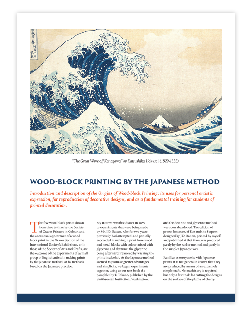
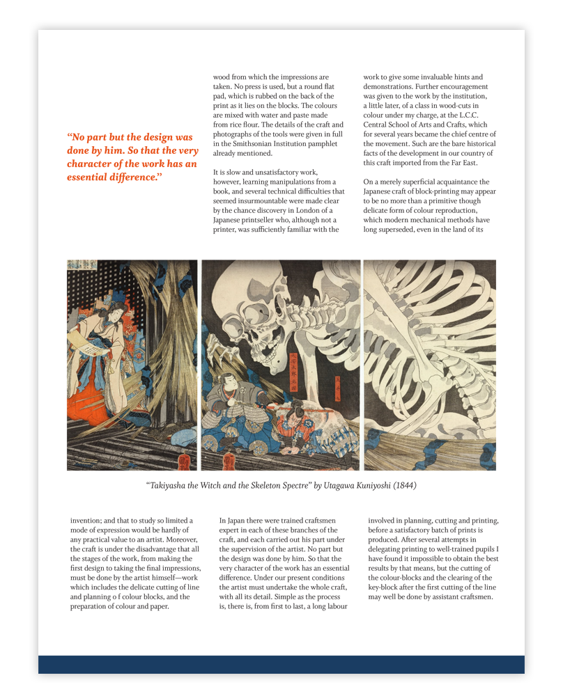
Create a magazine layout for a short article about Japanese woodblock printing. The copy was provided by the client and I was tasked with layout, colors and sourcing appropriate pictures.
Outcome
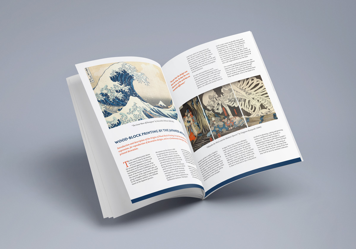
A three column layout was used for readability since it is a text-heavy document. One of the images is also spread across three columns to mimic the text layout. Two pictures were selected of Japanese woodblock prints that shared similarities in color scheme and those colors were brought over into page elements such as headers, subheaders and a border at the bottom of the pages.


