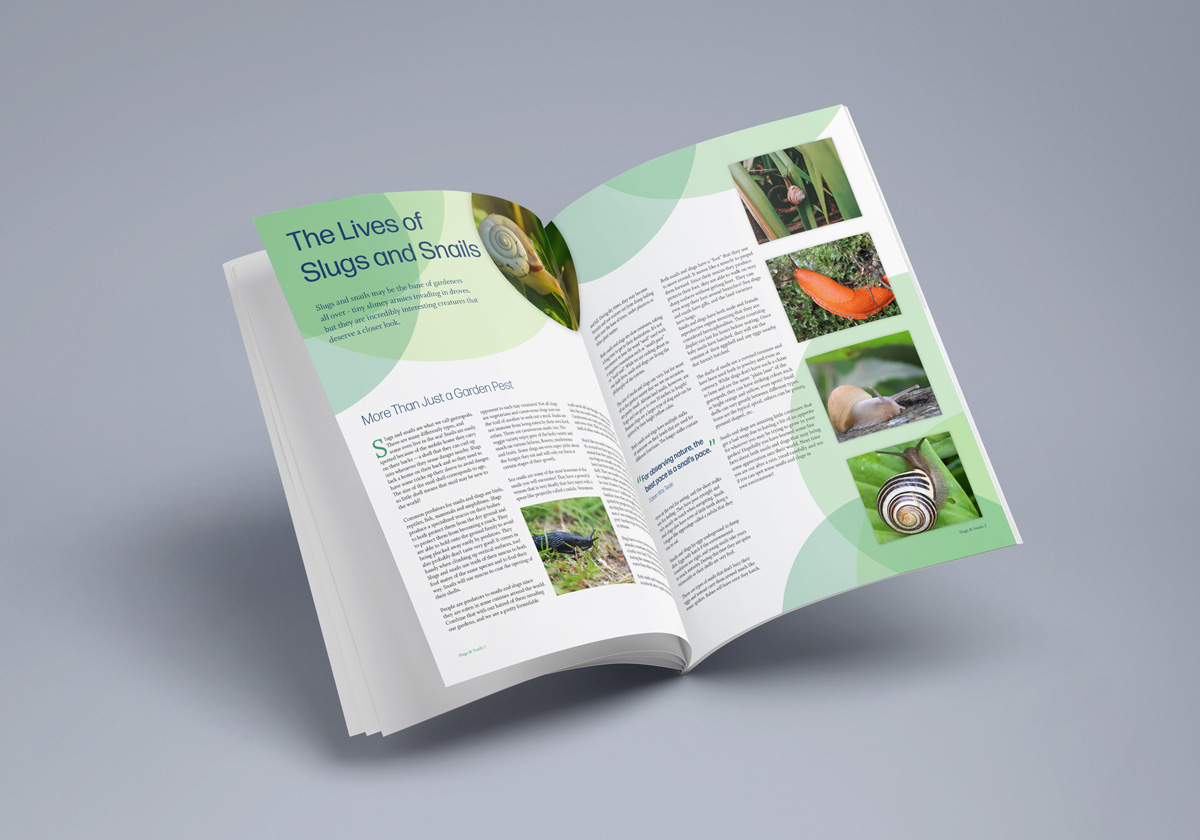
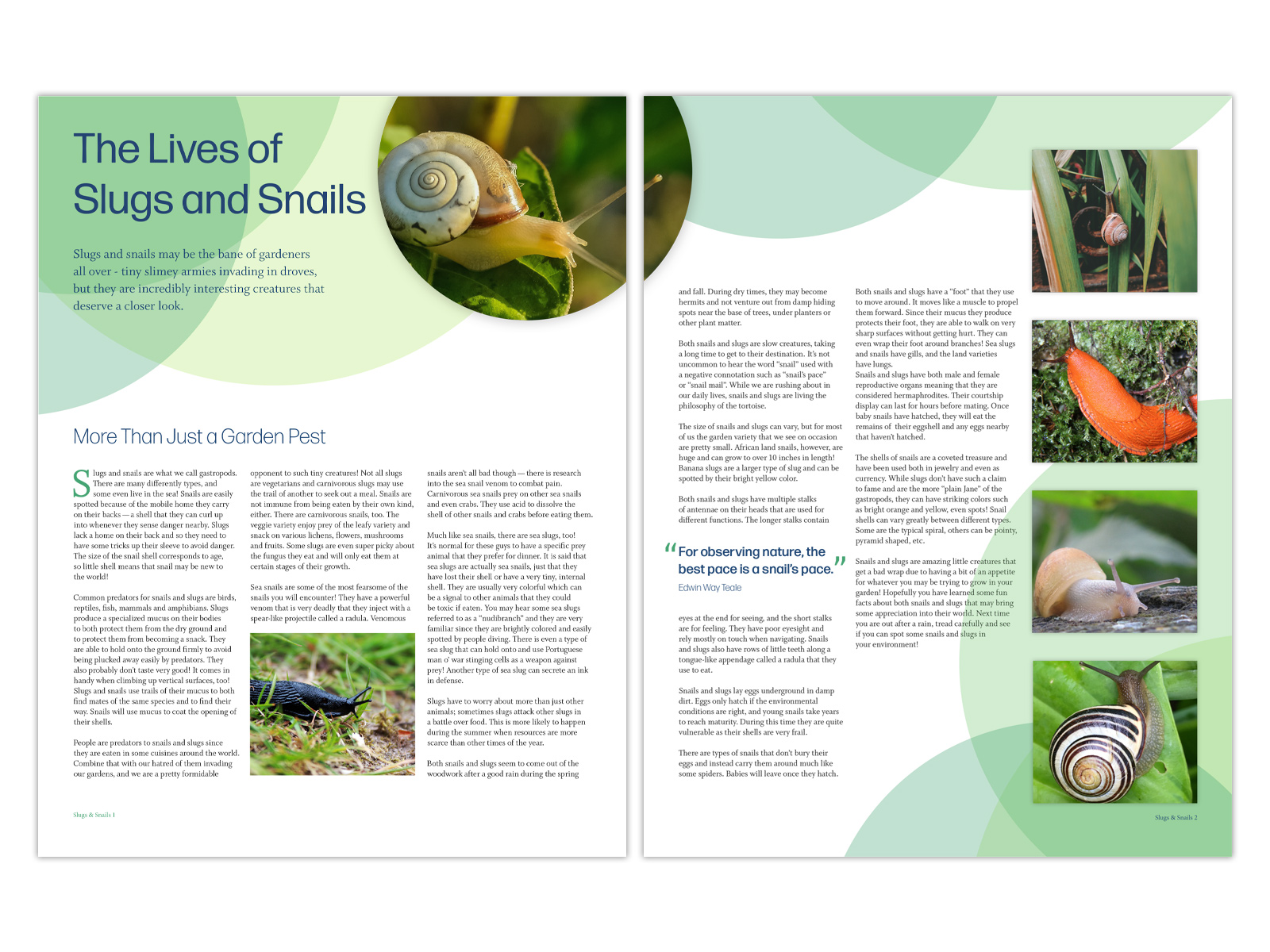
Brochure layout
Background
This was a fun project to create a two page spread for a brochure about slugs and snails. It was rather text-heavy, but needed to be interesting enough for a younger audience as well as adult readers.
Outcome
I used circle elements in various opacities throughout the design to mimic the shape of a snail's shell. A contrasting purple was used for the header and subhead text to make it stand out against the green. A bold, green drop cap is used to guide the viewer to the first paragraph of the copy. A photo and a pull quote break up the heavy text, and additional photos were added both in a column layout and in one of the circles to guide the reader around the publication.