Rightworks
Design: Brandy Dandy (all design work by me except where otherwise noted)
Logo and color palette creation
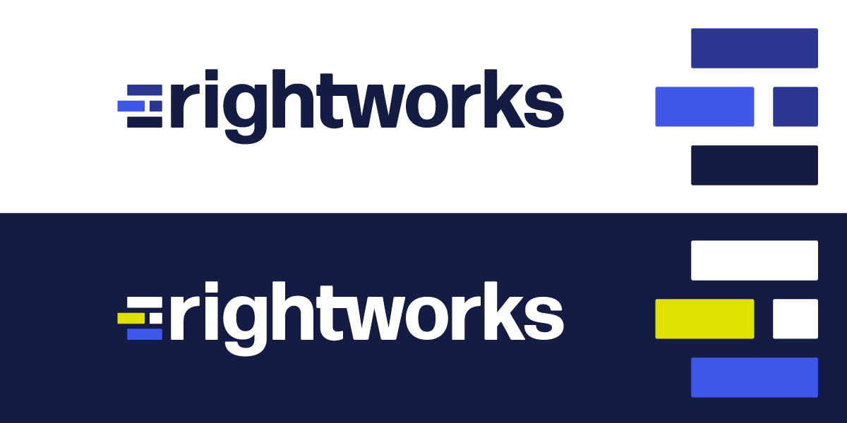
This logo concept was created by me for the rebranding of Right Networks to Rightworks. The idea for the logo mark came from the concept of building a solid foundation for your accounting business from our thought leader content. The brick shape is meant to convey a strong core or base to build onto. The initial color palette was chosen after examining Rightwork's competitors which were overwhelmingly orange, red and green. It is meant to convey energy and confidence.
These are the final logos which were further refined from the original concept by myself and two other designers on my team. The proportions of the bricks logo mark were adjusted and the corners were slightly rounded. The color palette was also expanded to include a sunset orange accent color.
G2 badge social graphic
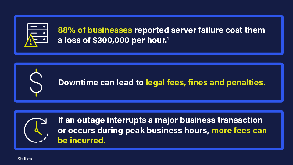
Product promotional social ad

Product promotional social ad

Webinar promotional social ad

News social banner
Customer testimonial social card
Blog graphic
Blog graphic

Aprimo DAM graphic

Aprimo DAM graphic